NordVPN Navigation
& Dashboard Overhaul
NordVPN is perhaps the world's most beloved VPN. With glowing reviews all across the web, highlighting the platform's high speeds, online security tools, streaming and torrenting capabilities, and web browsing tools.
As the product expanded, it faced design challenges related to scalability, particularly with users overlooking crucial features. This is a case study how I helped to solve it.

Problem
During my time at Nord, my main area of concentration revolved around enhancing the iOS and Android apps, which enjoyed significant popularity among our user community.
NordVPN started as a simple VPN service. It made it easy to secure your connection by pressing just one button.
As NordVPN grew, it added more useful features like Threat Protection and Dark Web Monitor and more. But we had a problem: how could we show these new features effectively?
The main screen of the app was mostly for the basic VPN function, so there wasn't much space to show off these important improvements. As so, the problem began to emerge.

User research
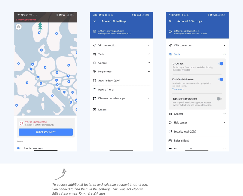
When working on a design project, it's important to back up your identified problem with data. At first, we wondered if the problem we thought existed was real. Maybe users already knew how to find the extra features.
We spent a week or two studying the data carefully, and we noticed something important. Only about 25-30% of users actually went to the settings screen, and even among those who did, only a few explored the new features. This data clearly showed that there was a problem.
Most of the user base, around 70%, didn't see all the great work done by other departments in the company.
This gave us a great opportunity to fix the issue.

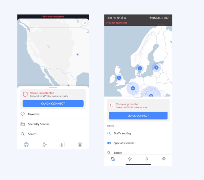
Introduction of bottom navigation on iOS and Android
Adding a bottom navigation to both platforms had many advantages:
Firstly, it created more room for users to find and try out functions and features that were hidden before. The bottom navigation was easy to access and made it simple for users to reach.
Also, this smart design change let us run A/B tests. We could see which features and pages were popular and how they were used by millions of NordVPN users.

Problem solved, right? Not quite
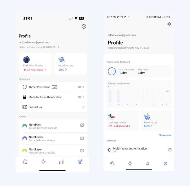
User profile
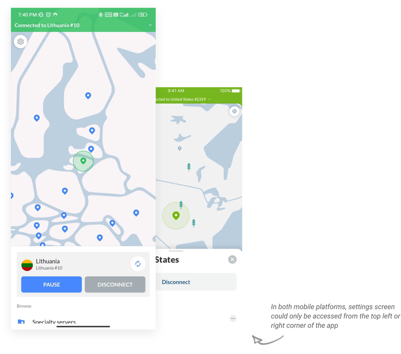
The mobile navigation system served us well for a considerable time. However, we encountered a significant challenge stemming from the limited space available at the bottom of the screen—an issue of scalability. What if there were more than five important elements we wanted to highlight? Sure, we could create a "More" page and list everything there, but we aimed for a more innovative approach.
With unanimous agreement, we set a new goal: to design an interactive page that would encompass all essential user information, including account data, security status, and new features. Thus, the concept of a user profile page was born.

Overall impact
Designing, testing these features took some time and dedication, but the results were worth it.
3x
Increase in feature use because they were not hidden under the settings.
Clarity
In your account data. When your subscription is ending. How much you have left or what do you have to do next..
Scalability
The combination of user profile and bottom navigation bars allows the company to expand wiath its offering and theres room to showcase cool things in the future.