Overview
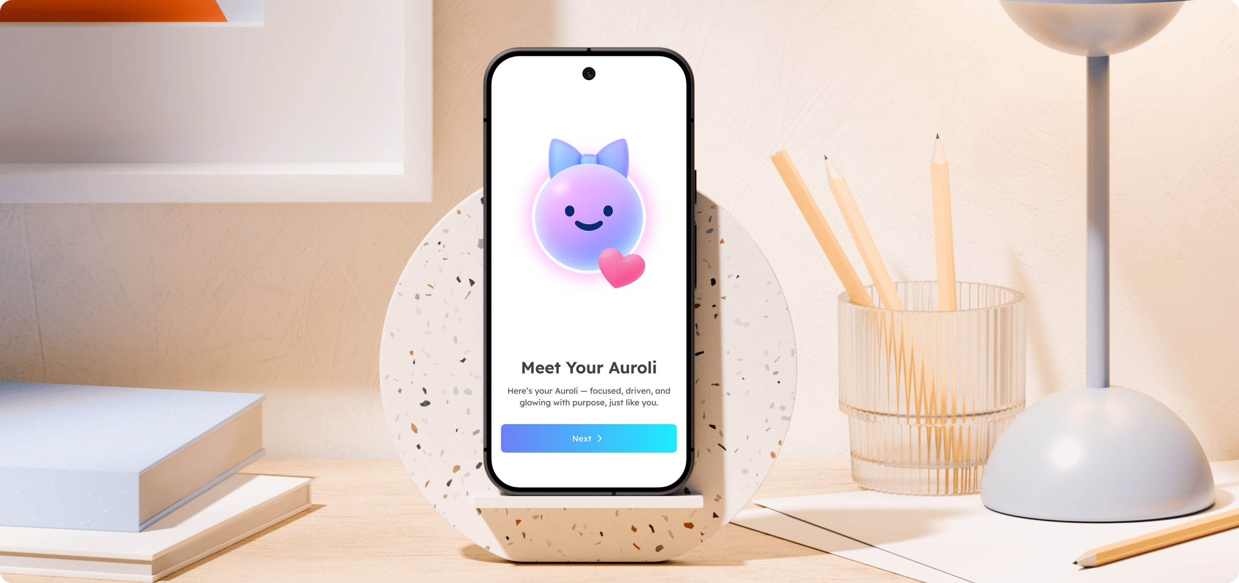
Auroli is an AI wellbeing companion built for people who struggle with consistency, especially ADHD brains. Think of it like Google Health or Apple Health, but with an ADHD twist. It connects your wearables and health platforms, reads your body signals across sleep, movement, and burnout risk, then a specialised AI coach helps you make sense of it all in plain language.
I partnered with Corner Case Technologies to lead the product design end to end: research, the Auroli mascot, onboarding, the dashboard and stats system, and the AI coach experience. The starting question was simple but hard. “Why can't I just be consistent?” Most health apps answer that with more dashboards and more numbers. We wanted Auroli to answer it by reading what's actually happening in someone's body and turning it into a calm, doable plan, delivered by a companion that feels alive rather than clinical.
Details
Project Scope
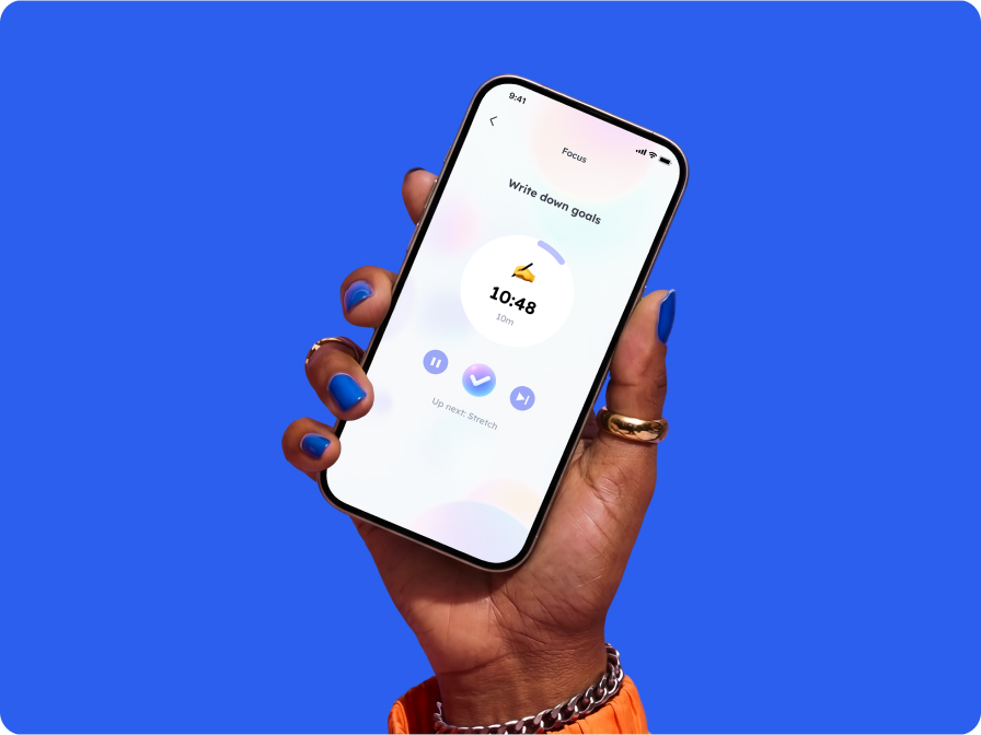
The Research
Before opening Figma, I built a deep understanding of how ADHD affects daily habits. I mapped both sides: strengths like hyperfocus and creativity, and challenges like time blindness, choice overwhelm, and irregular routines. That research set clear priorities. Quick onboarding with results from day one. Visual progress over heavy stats. A friendly tone with no guilt. The core insight: this audience doesn't need more data, they need to know what it means for them today.
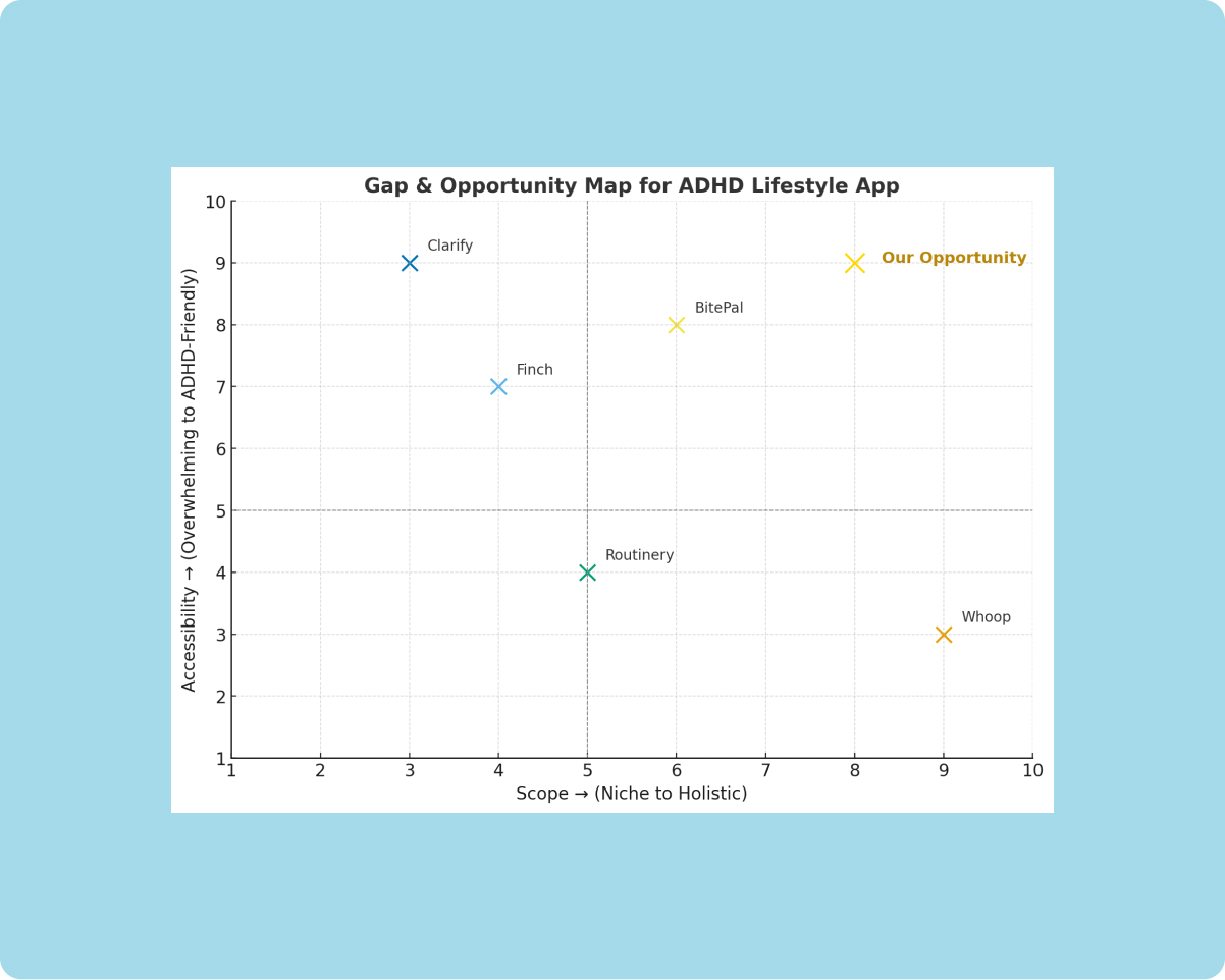
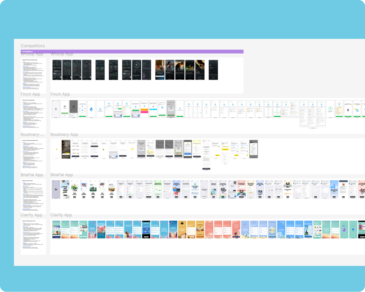
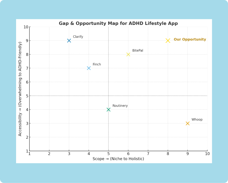
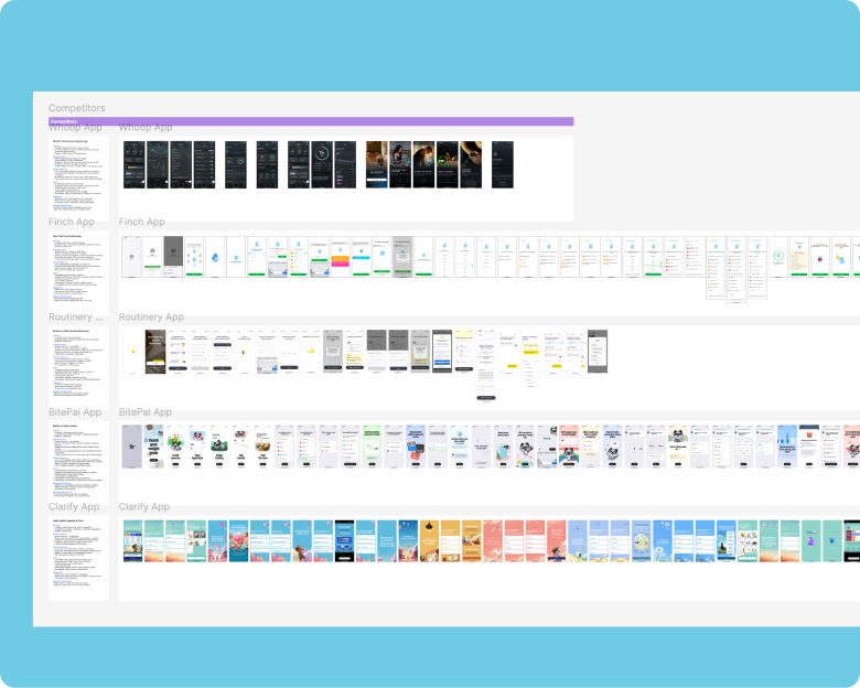
I also audited five competitors: Whoop, Finch, Routinery, BitePal, and Clarify. Two patterns stood out. Apps with serious health data felt cold and clinical. Apps that felt warm leaned on a character but lacked depth. The opportunity was to combine both, real body-data intelligence delivered through something that feels good to open.
Meet Auroli: An Adaptive Companion
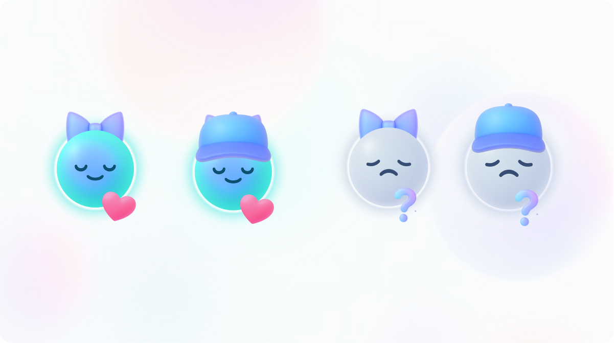
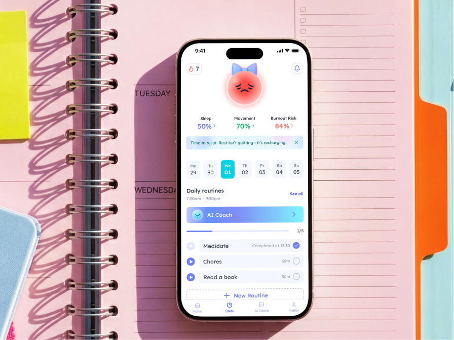
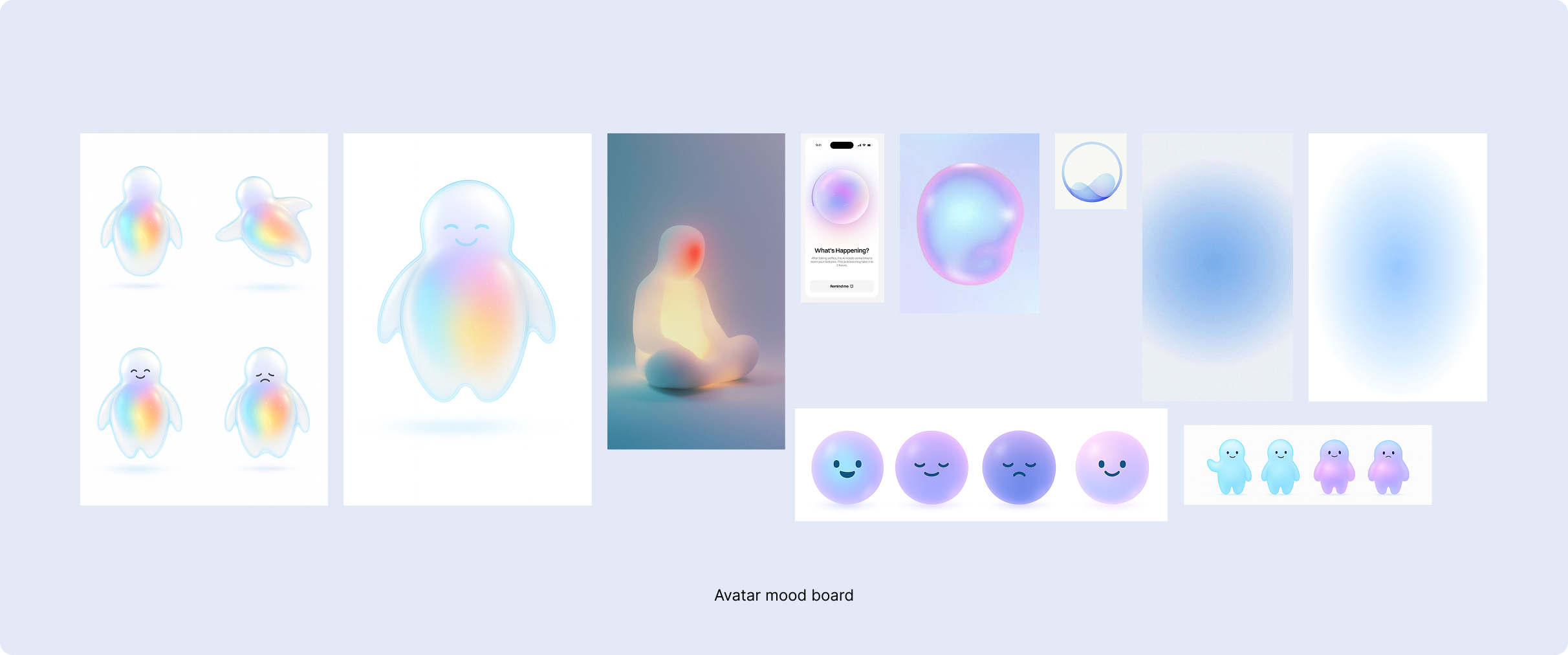
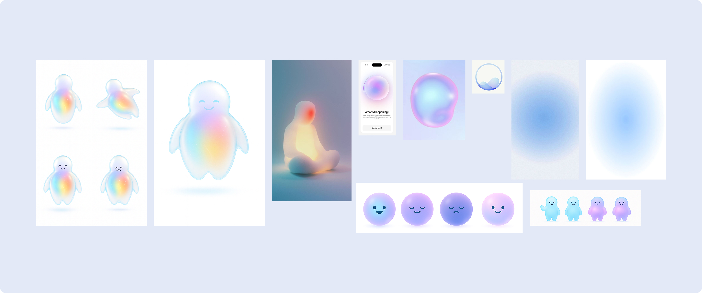
Auroli is a friendly, minimal character that represents the spark of a person's inner energy. Rather than a cold interface, Auroli makes the experience feel warm. The user's mood and energy show through its aura, a soft color that constantly shifts. As healthier habits build, the aura warms toward a radiant gold. When energy is low or burnout risk is high, it dims to a muted red. Progress you can feel at a glance, no charts required.
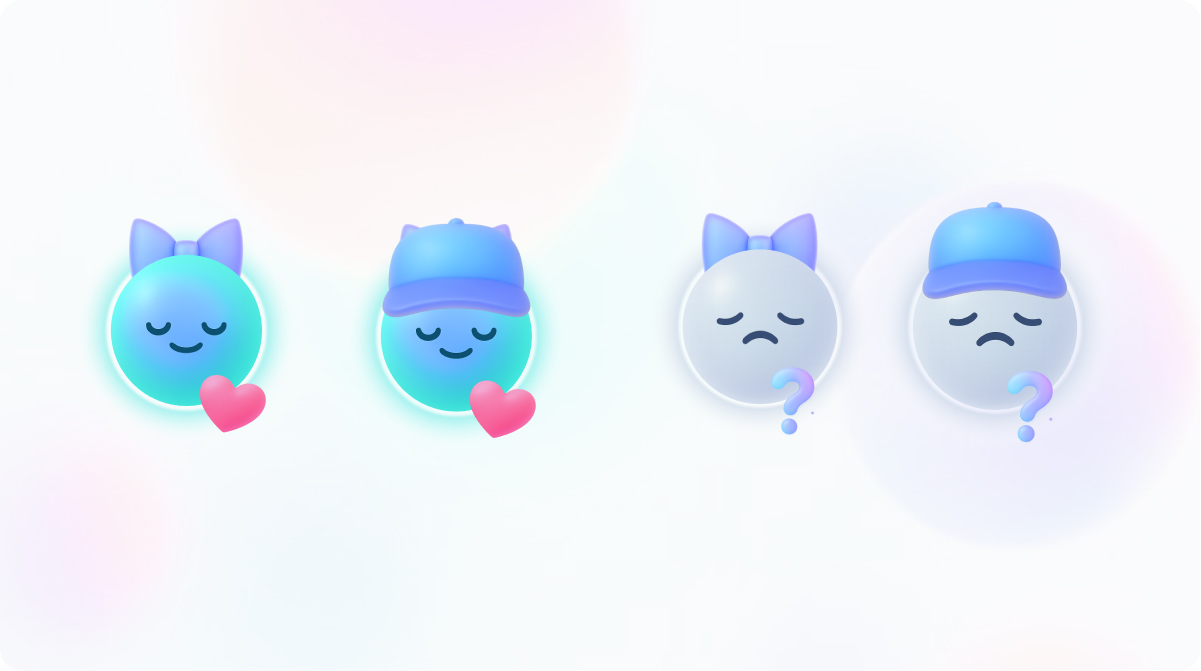
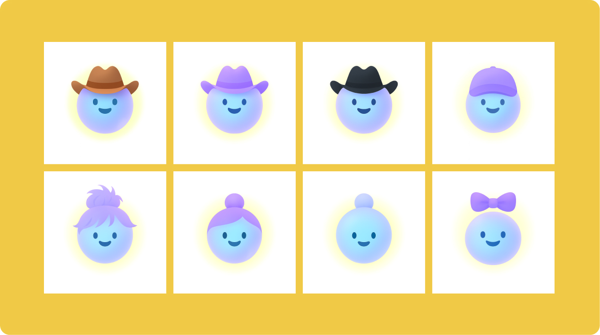
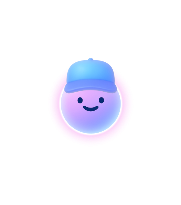
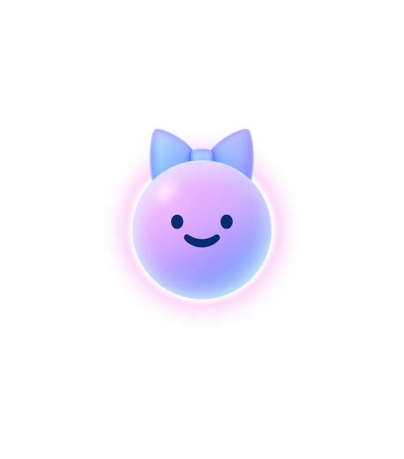
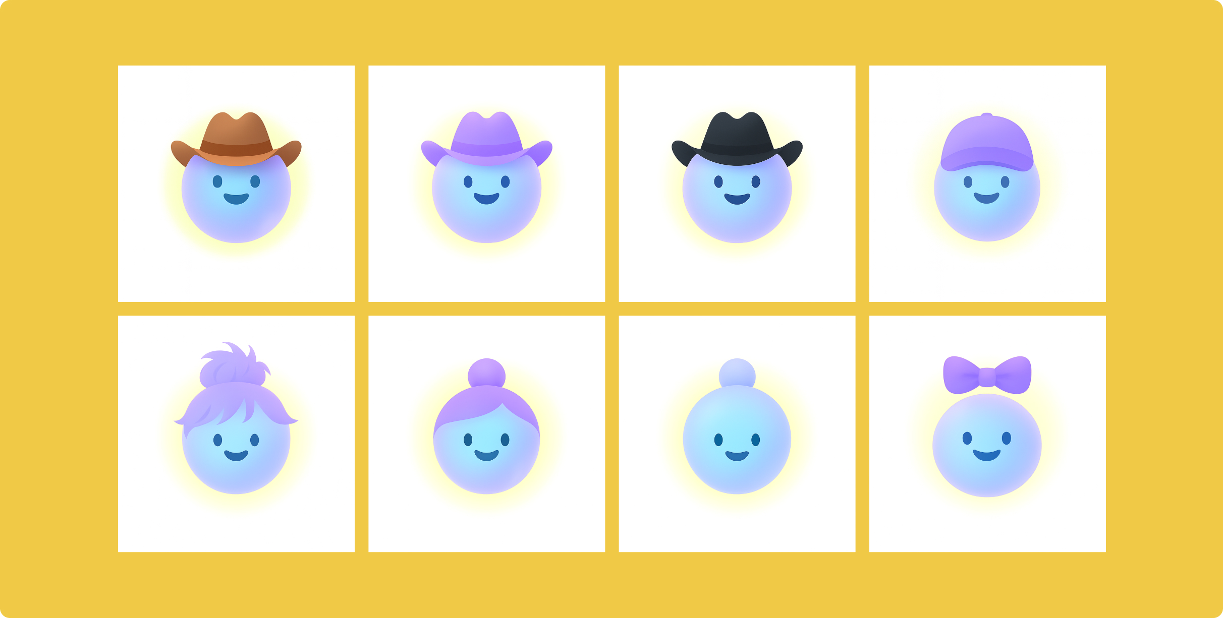
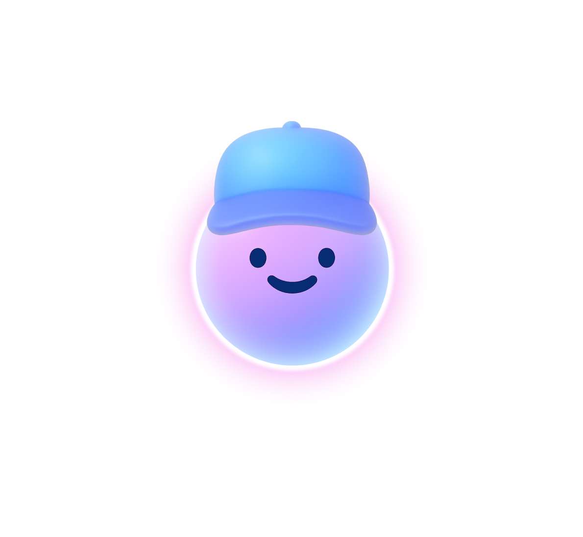
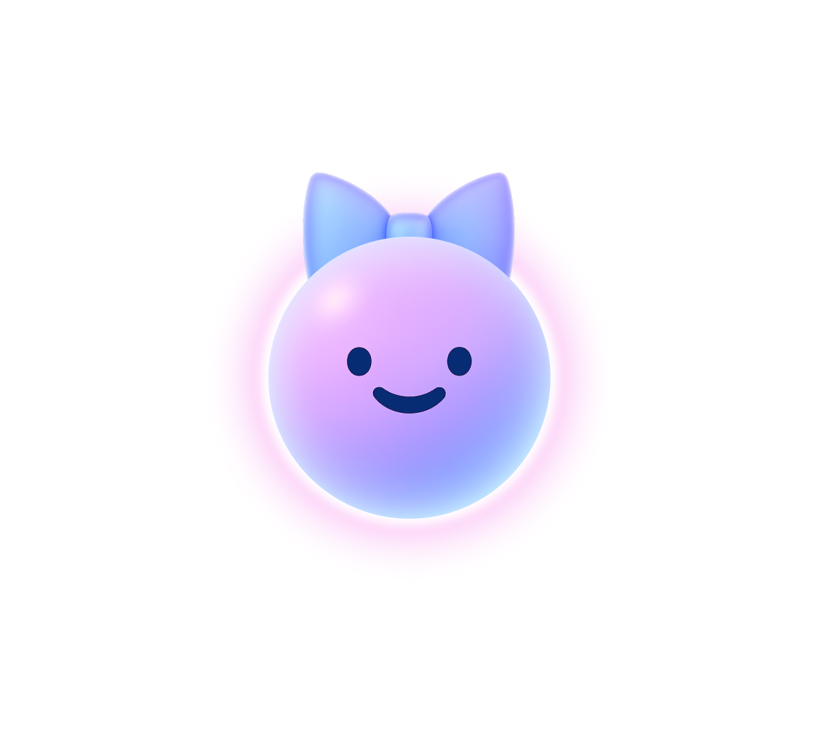
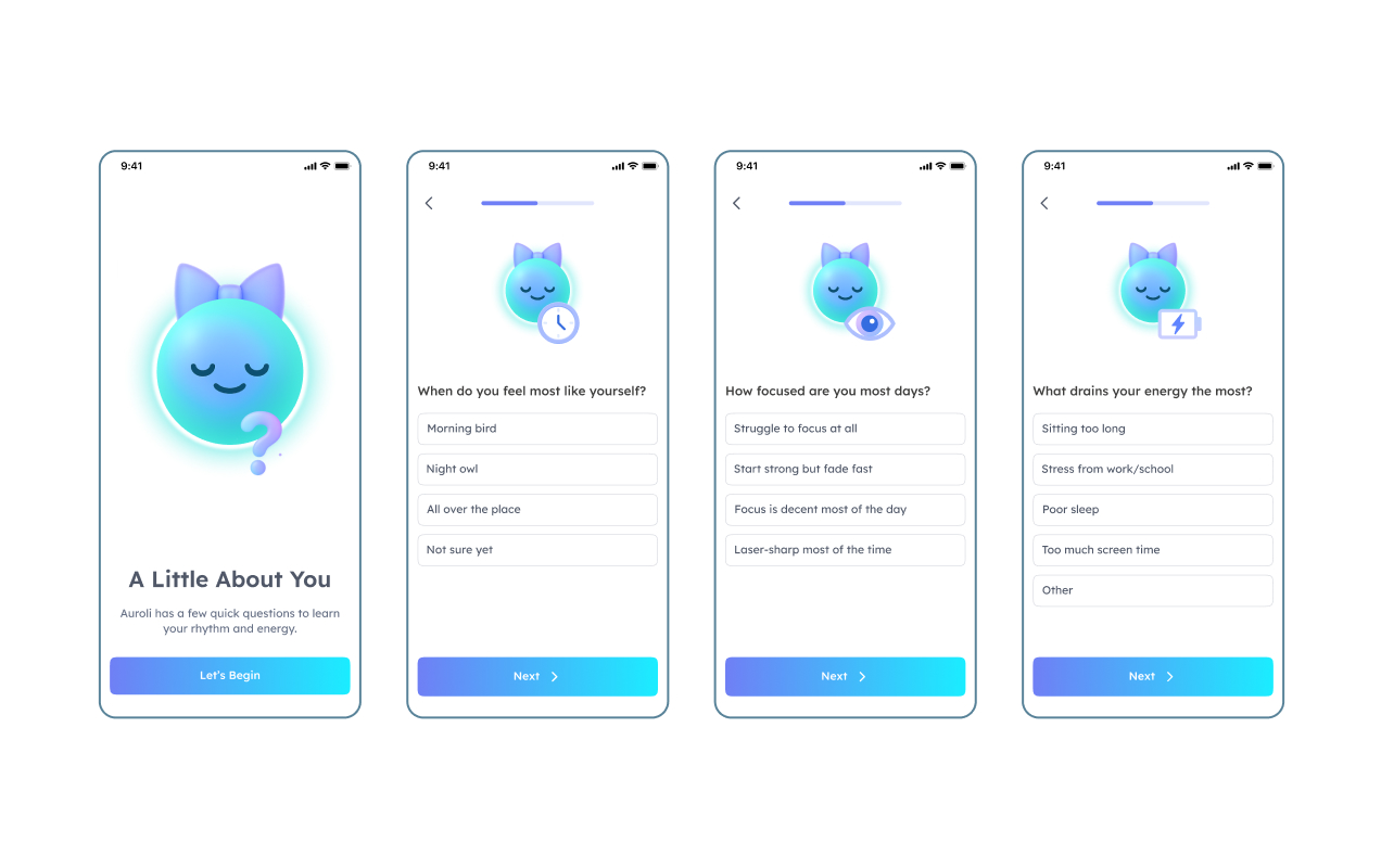
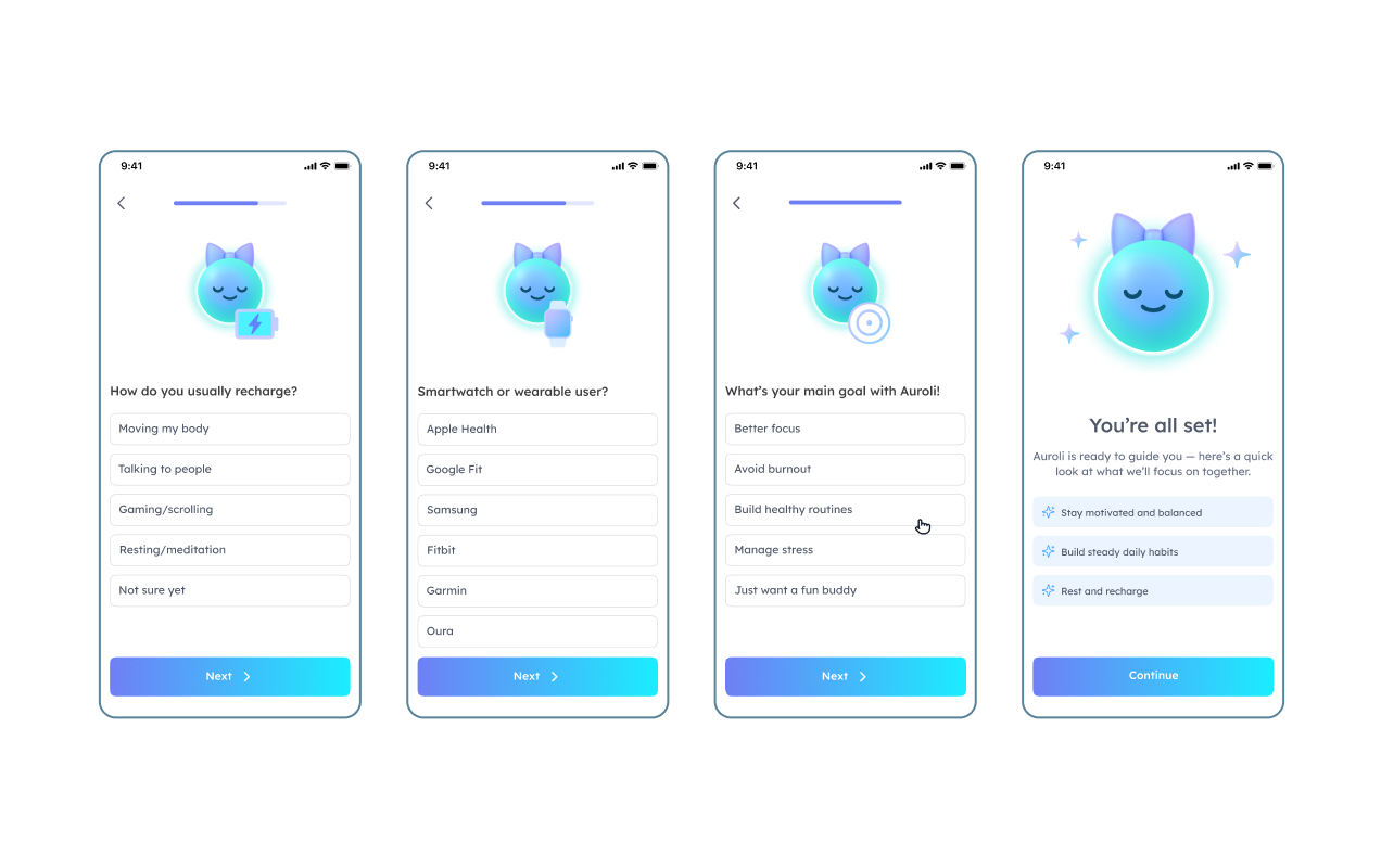
I deliberately avoided human or animal features. The moment you add hair or a hat, it becomes an emoji and loses its meaning as a symbol of your energy. I explored those directions anyway, generating versions with caps and messy buns, to show the team why they didn't work. Instead, users pick between two abstract forms, a rounder softer shape and a squarer firmer one, both genderless. Auroli's moods are animated and it appears across the app reacting in context, holding a clock when asking about your rhythm, a battery when asking how you recharge. It becomes the connective tissue of the whole experience.
Onboarding: A Calm Questionnaire
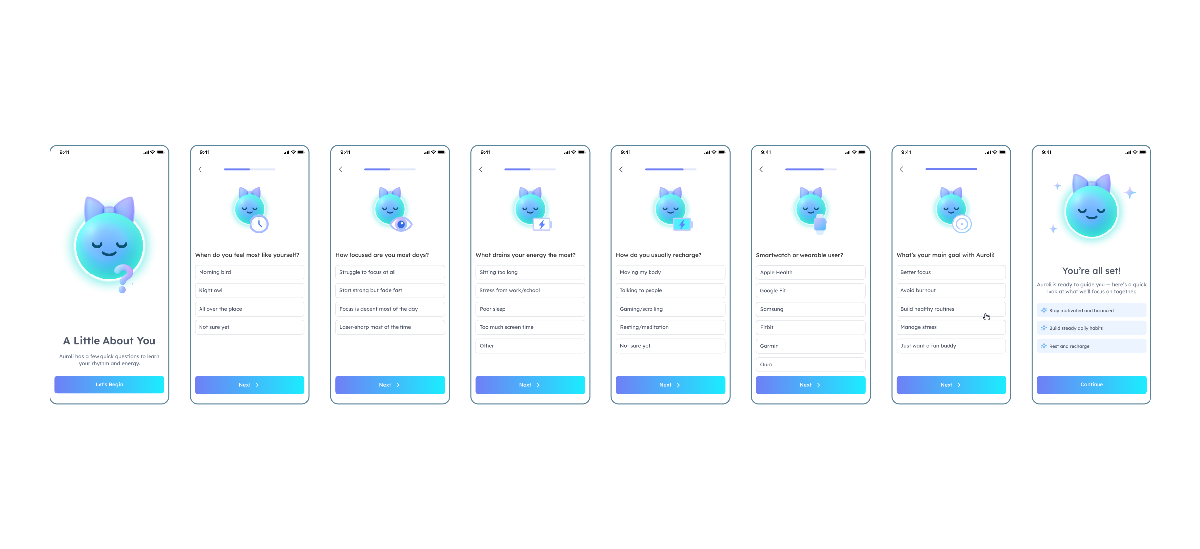
For an ADHD audience, a long or cluttered setup is the fastest way to lose someone. So I designed onboarding to feel like a calm conversation, not a form. The flow introduces Auroli, walks through the core pillars (routines, food, journaling, balance), then moves into a wizard that asks one question at a time with a small set of clear options. When do you feel most like yourself? What drains your energy? How do you usually recharge? A progress bar keeps the end in sight, and a “Why we ask?” moment reassures users that every answer makes the experience more relevant. By the end, Auroli has what it needs and the user has met a companion that already feels personal.
The Dashboard and Stats System
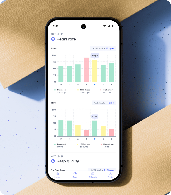
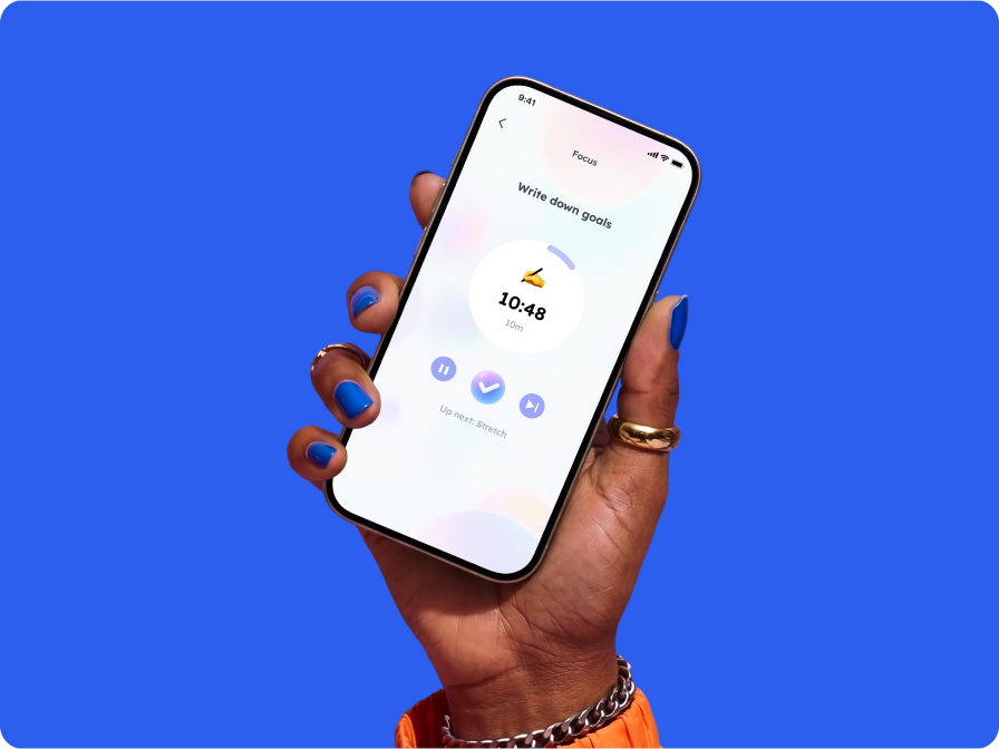
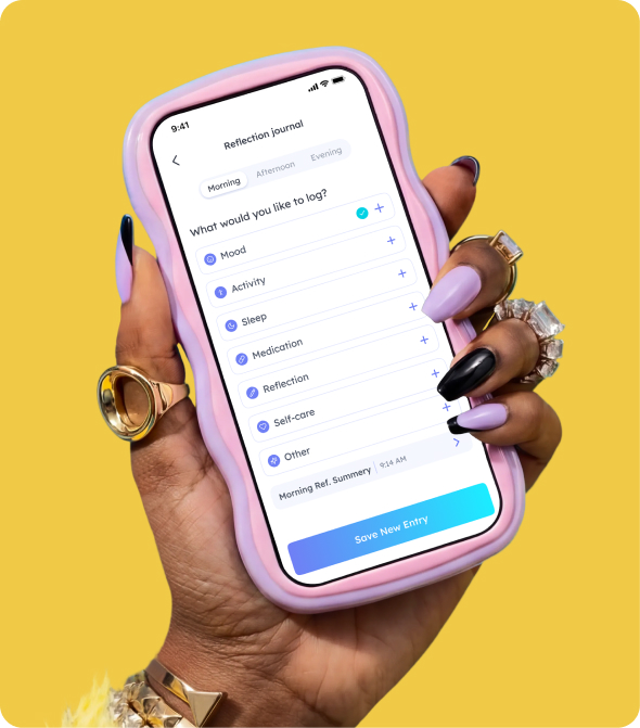
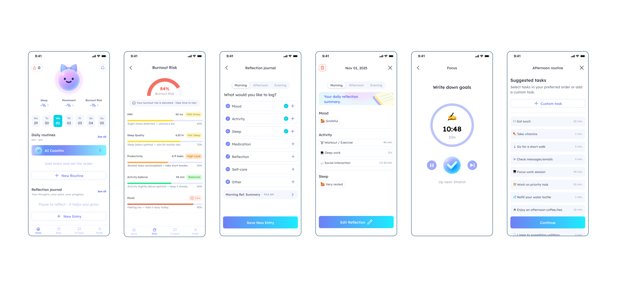
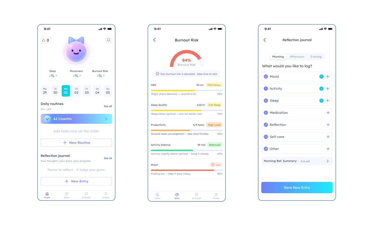
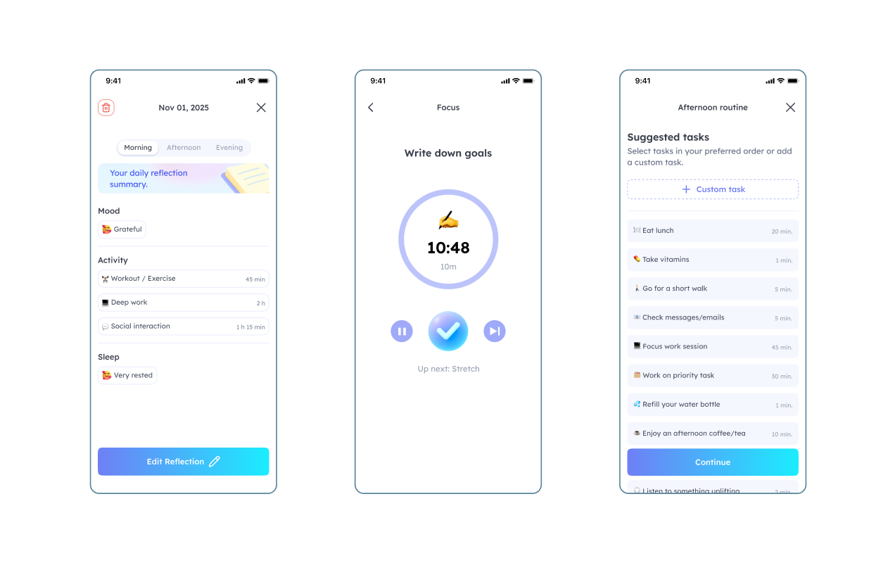
The home dashboard is the heart of the product. Auroli sits at the top, its aura reflecting your current state, with three headline signals beneath it: Sleep, Movement, and Burnout Risk. Below that, the day's routines, reflection journal, food, and water all live in one scannable view. The whole thing is built to be glanceable rather than studied. Because this is a real health hub pulling from connected devices, I designed every screen across its full lifecycle: empty states for when no wearable data has synced yet, loading states, active states once data flows in, and alert states when something needs attention.
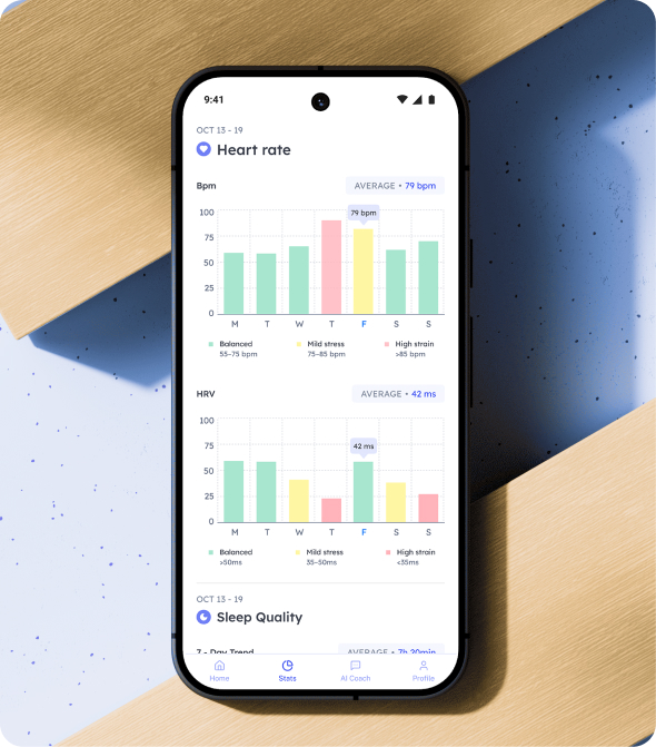
Each metric (sleep, movement, burnout risk) has its own detail view with trends, plain-language insights, and gentle tips. A big part of this was the language. Raw numbers like HRV mean nothing to most people, so I built a state naming convention that translates data into intuitive labels. HRV becomes Balanced, Mild Stress, or High Stress. Burnout risk becomes Low, Moderate, or Elevated. Instead of “84%,” the app says your burnout risk is elevated and suggests taking time to rest. The data is still there, but it never leads with intimidation.
The AI Coach
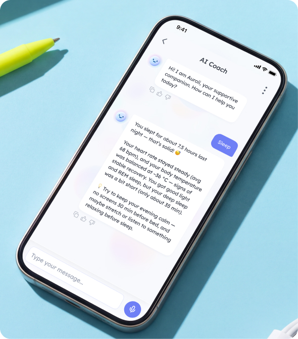
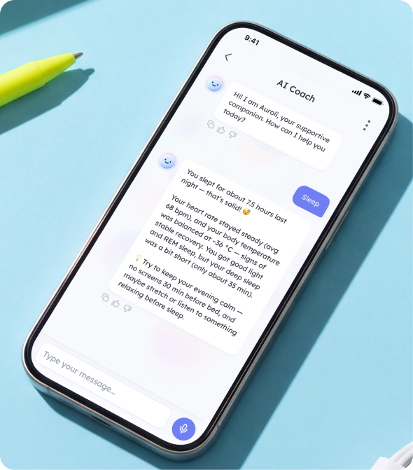
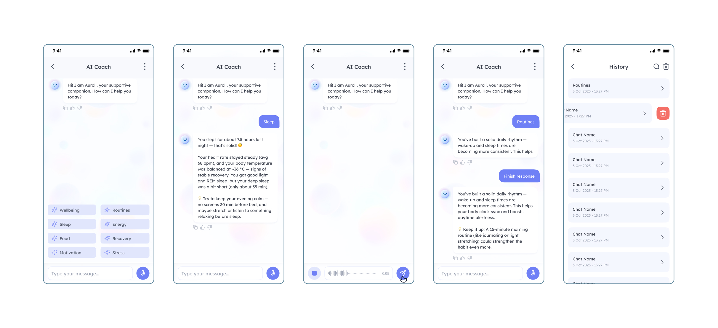
The AI coach is where the ADHD twist really lands. It's a specialised LLM that knows your connected health data and helps you navigate your problems conversationally. Open it and Auroli greets you with quick topic chips: Wellbeing, Routines, Sleep, Energy, Food, Recovery, Motivation, Stress. Tap one and the coach responds with insight grounded in your actual data, like explaining that you slept 7.5 hours with steady heart rate but short deep sleep, then offering a concrete, doable suggestion.
We designed the full conversational system: the resting state with topic chips, the loading and generating states, streaming text, a stop-response control, and user-typing states. The tone is always supportive and specific, never preachy. It's the difference between an app that shows you a number and a companion that tells you what to do with it.
Process and AI Workflow
This was a European-funded project, so the client was effectively internal. We worked against a defined set of requirements, with the goal of spinning Auroli off into a new health startup originating from Lithuania. That framing mattered: we weren't just shipping screens, we were building the foundation for a fundable, investable product. I led the design and mentored a junior designer throughout the process, guiding them across research, component work, and the production screens.
AI was woven into our workflow from the start. We used Claude and ChatGPT for research synthesis, copy, and pressure-testing the AI coach's tone, and Google Nano Banana for image generation. For the mascot, that meant rapidly exploring variations, including the accessory-heavy versions I argued against, which made the minimal direction easy to sell to the team. This was never about automating the thinking. It was about reaching the interesting decisions faster, so we could spend our time on judgment: what the character means, how the data should read, and what this audience genuinely needs.
App is being tested across focus groups and is getting ready to launch in late 2026.